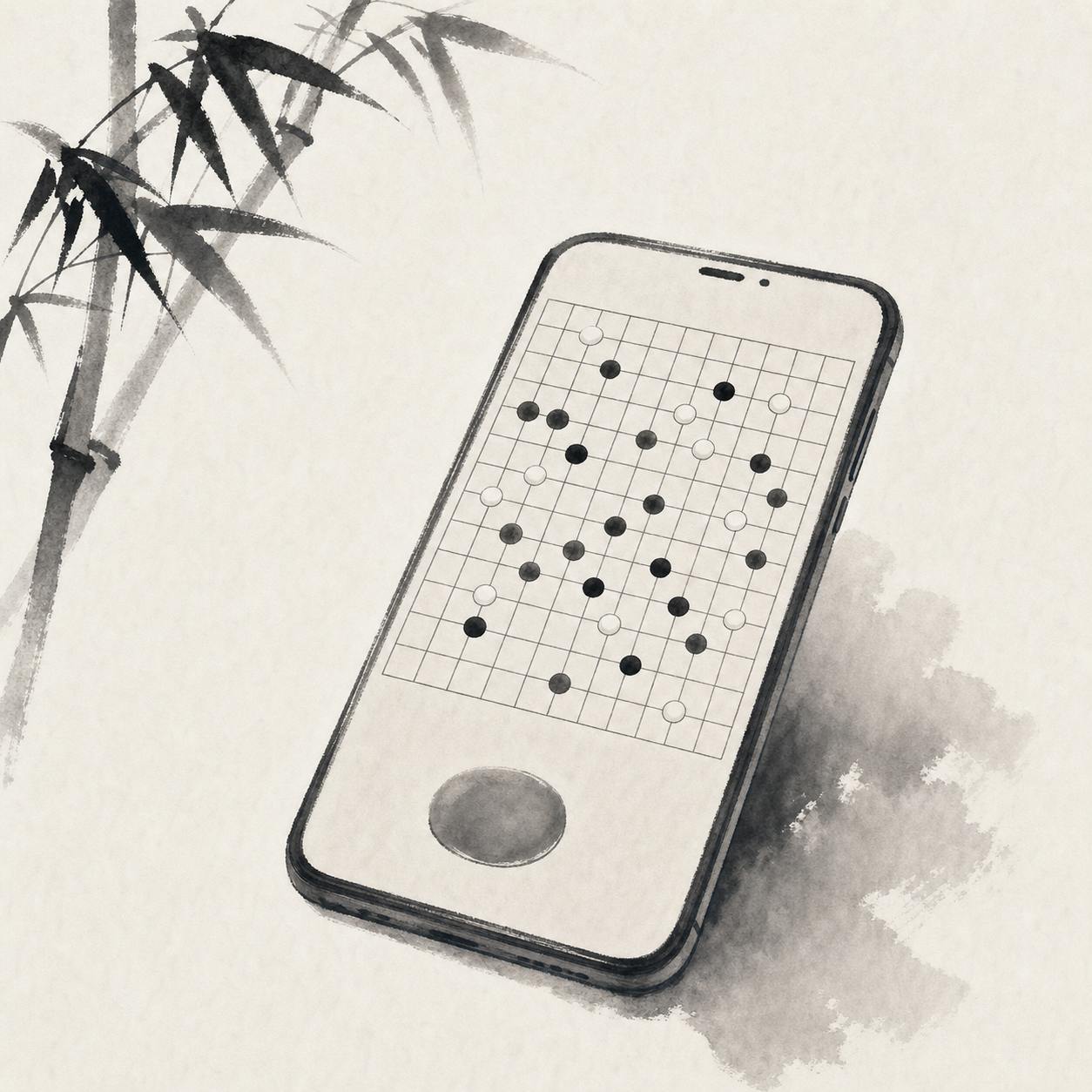
You saw White’s four-in-a-row. But as you dragged the board, your finger brushed the intersection beside it. The clock is still ticking, your opponent has already received the move, and once the takeback request goes out, the air changes. On a phone, the pressure of Gomoku and Renju often begins outside the pattern itself.
This is about a very small design choice: the move confirmation button. Usually, after you tap an intersection, you must press “Confirm” once more before the stone is sent to the server. It looks like an extra step. In practice, it changes the breathing of the whole game.
Mis-taps happen most when you think you are steady
The problem with a phone board is plain enough: the intersections are dense, fingers are blunt, and your fingertip blocks your view. On a 15-by-15 or 19-by-19 board, the edge lines, star points, and neighboring intersections are all compressed into a small pane of glass. You may think you tapped the crossing at four-three. The system may read the point next to it.
Interaction design often talks about target size. The WCAG 2.2 guidance on target size discusses tappable areas and the risk of accidental activation together. A board intersection is not an ordinary button, but the problem is similar. To tap accurately, you first need to see clearly—and your finger needs room.
A confirm button splits a move into looking and committing
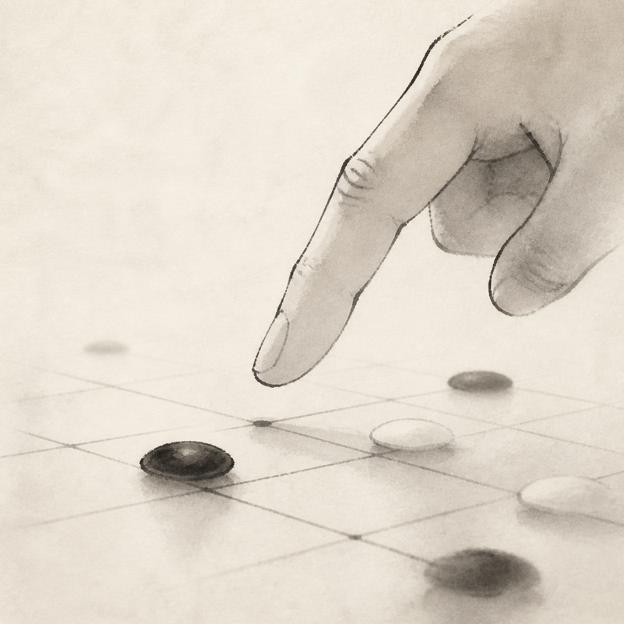
With a confirm button, the first tap feels more like a trial placement. The stone appears on the intersection, while its color, shadow, or outline makes clear that it has not yet taken effect. You can look once more: does this stone block your opponent’s open three, create your own double-three, or step onto a forbidden-move line under Renju rules?
Only the second tap commits the move. The pause is brief, often less than a second, but it separates the motion of your finger from the decision on the board. In that gap, you tend to scan the position again, especially the eight directions around the last move.
Under time pressure, one more step can make the tempo steadier
Many players worry that confirmation slows the game down. The worry is reasonable. In fast games especially, one extra press on every move can consume attention. A good confirmation interaction cannot take over the stage. It should sit close to the thumb zone, show its state clearly, and make cancellation immediate.
But the mistakes that come under byo-yomi often come from moving too fast. You see your opponent’s four-in-a-row; your first instinct is to block. The finger arrives before the mind does. A confirm button adds a tiny brake. “I already tapped” becomes “This is how I’m preparing to play.”
Half a beat slower often saves a move.
In online Renju, that brake matters even more. Whether Black has made a double-three, double-four, or overline can decide the game, and different rule rooms may judge them differently. If the preview stage can show forbidden-move hints at the same time, you can catch the problem before committing, rather than scrambling for another point after the system rejects the move.
When takebacks fade, the relationship across the board gets cleaner
After a mis-tap, the most common move is to request a takeback. Among friends, that may be fine. In a random match, it can turn awkward. Your opponent cannot know whether you really tapped the wrong point, or whether you changed your mind after seeing the position turn against you. One request pulls the judgment off the board.
A confirm button cannot eliminate regret. But it can reduce one low-value kind of dispute: a slipped finger, a dragged screen, a touch at the edge as you lift your hand. You check before submitting; after submitting, you accept the result. The boundary of the game becomes much clearer.
Good confirmation should not make the board noisy
The hard part of a confirm button is not whether it exists. It is whether it appears with restraint. If the button is too large, it crowds the board. If its color is too heavy, it steals attention from the last move. A pop-up confirmation is worse: it pulls your eyes away from the shape. Chess-like interfaces need quiet, especially when the local fight is dense.
A better approach is to leave the candidate stone where it is and place the confirmation control somewhere your finger can reach easily. Cancellation can happen by tapping elsewhere, tapping the candidate stone, or using a light button. Material Design’s gesture guidance also notes that touch actions need predictable feedback. On a board, the preview state is exactly that feedback.
Sound and vibration need care, too. A successful commit can have a faint tactile cue; the preview stage should stay quiet. If the two states feel the same, it becomes hard to tell whether the stone has already taken effect.
From tengen in the opening to open threes in the middle game, confirmation serves judgment
When you play tengen in the opening, the confirm button mainly prevents a point from slipping. In the middle game, it begins to serve reading: does this move force an answer, can the next move make an open three, does White have a resource to counter with a four-in-a-row? You tap the candidate point and see the stone settle into the shape. The judgment becomes more concrete than an image suspended in your head.
I have noticed that many bad moves happen just after you “see a line.” You fixate on a horizontal four and miss the diagonal counterattack; you stare at your own open three and fail to notice that the same move also lets your opponent make a four. The preview state pins down the last move and gives your eyes one more route to check.
Give the choice back to the player, and the interface quiets down
Move confirmation is not for everyone. Some players want the fastest possible rhythm and are willing to bear the cost of mis-taps. Others treat phone games as evening practice and want every move to land with confidence. A good board should make room for both habits.
That is where the design judgment lies: offer safety by default, and preserve speed in settings. Make the prompt clear, the button easy, and the state readable. The board itself will feel more refined—and easier to stay with.
Good confirmation gives attention back to the board.
In your next mobile game, try turning on move confirmation for one round. Notice the moments when you nearly tap the wrong point or almost miss something. You may find that composure is only one light confirmation away.