
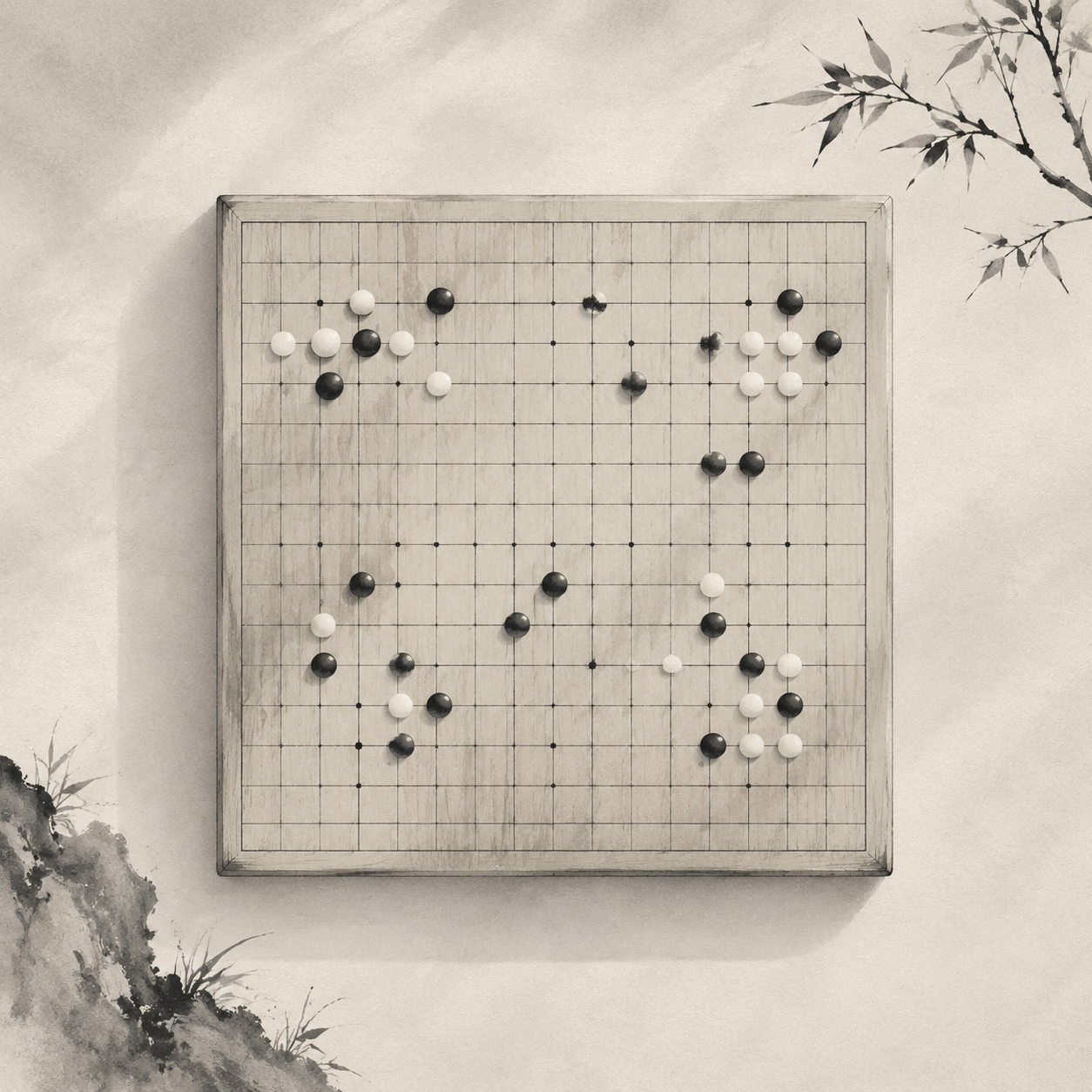
Gomoku appears to be a game you can simply continue playing once you can see where the stones have been placed. Yet on a real tabletop or screen, information is often handed over to color first. When the light is dim, the screen is reflective, or people perceive color differently, color alone quickly loses its force. For a board to let players steadily read the position through its lines, points, and stones, it needs another layer of cues.
Color Is Only One Layer of Guidance
Color is highly efficient, but also highly fragile. It depends on lighting, display hardware, and an individual's ability to distinguish hues. When key states on a board are expressed only through red and green, light and dark, or highlights, the information becomes ambiguous as soon as it enters a low-light setting. Players with low vision may see broad areas of similar gray rather than clear relationships within the game.
Whether the board is physical or digital, a position needs to be scanned quickly. Gomoku and Renju are typically played on a 15×15 board, where the intersections are dense and move recognition depends on position and relationships. When every state is conveyed only through color changes, the board mistakes “being seen” for “being understood.”
The 15×15 Grid Must Be Clear First
The ACM CHI 2019 paper “Let’s Play Together: Adaptation Guidelines of Board Games for Players with Visual Impairment” notes that relying on vision alone keeps some players away from the table. A better approach combines color, contrast, icons, textures, shapes, and tactile patterns, giving information multiple paths to reach the player.
This means board design needs to give every state a second language. Position can be confirmed through the grid and surrounding space; stones can be distinguished through their outer contours and surface patterns; prompts can be supplemented with symbols or numbers. Color helps information register at a glance, while the other cues confirm what it means.
Visual Information Needs a Backup
This is why a second layer of cues matters. The board's edges can use subtle changes in line weight, stones can retain a consistent outline, and key areas can be marked with symbols rather than color blocks alone. Color draws attention first; contours, spacing, and shape anchor the meaning.
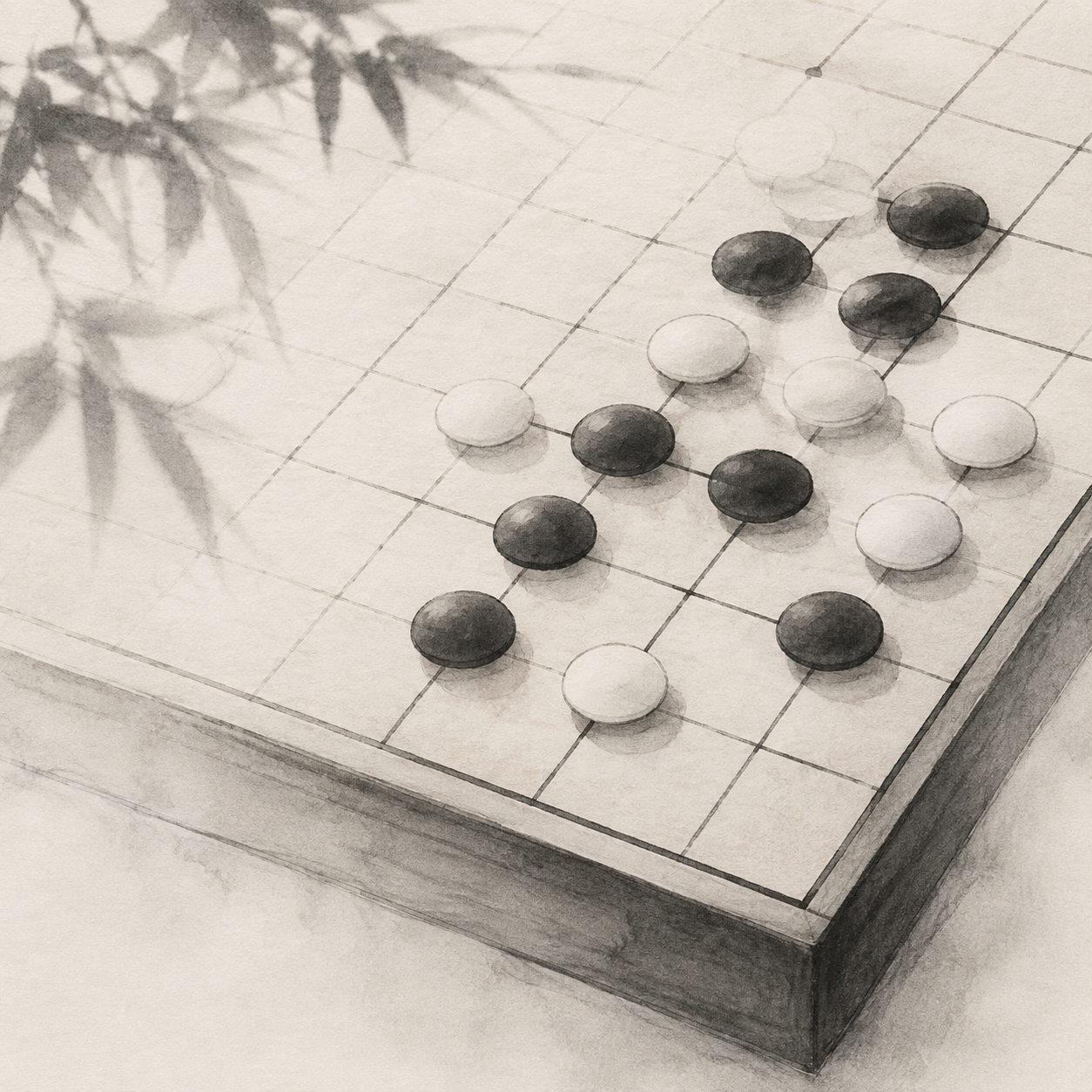
The same principle applies to digital boards: if a move indicator only changes the background to a lighter shade, projection, glare, or a system-wide dark mode can quickly distort it. Borders, symbols, and whitespace can anchor the state again, keeping the board consistent across devices.
Touch Makes the Board More Reliable
Physical boards are especially well suited to an additional tactile layer. Grid edges can have a slight relief, black and white stones can use different surface finishes, or patterns can be added to the underside and symbols to the top. Tactile differences do not call attention to themselves, yet when the eyes are tired, they can bring the game back into the hands.
Tactile information also helps several people share the same board. A spectator, practice partner, or someone with fluctuating vision does not have to keep asking, “What color is this stone?” When position, shape, and material can all communicate, the board feels quieter, yet more complete.
Screens Amplify Ambiguity
Digital interfaces often use color even more heavily: prompts, wins and losses, the most recent move, and forbidden-move areas may all be distinguished through blocks of color. The problem is that screen brightness, night mode, and outdoor light change how difficult these states are to identify; differences in color vision can also erase the boundaries between red and green, blue and purple, or pale gray indicators.
Low-vision design places greater emphasis on strong contrast, legible shapes, and avoiding situations where color carries communication by itself. In Gomoku, a highlighted move can be paired with an outer ring, arrow, number label, or localized magnification; placed stones can use a consistent language of outlines, rather than leaving every distinction to changes in lightness or darkness.
Color can offer a cue; shape, texture, and contrast are what confirm it.
Bring the Cues Back to the Game
A good board does not make its supporting information noisy. It simply lets players see a position at a glance, identify a state by touch, and continue playing through contours and rhythm when the light deteriorates. The principle applies equally to physical and digital boards: recognition must be stable before aesthetics can take over.
The core of Gomoku is simple, but the board's expression should not be limited. One more layer of cues means one fewer misreading and one less pause, allowing more people to continue placing stones through their own modes of perception on the same 15×15 grid.