
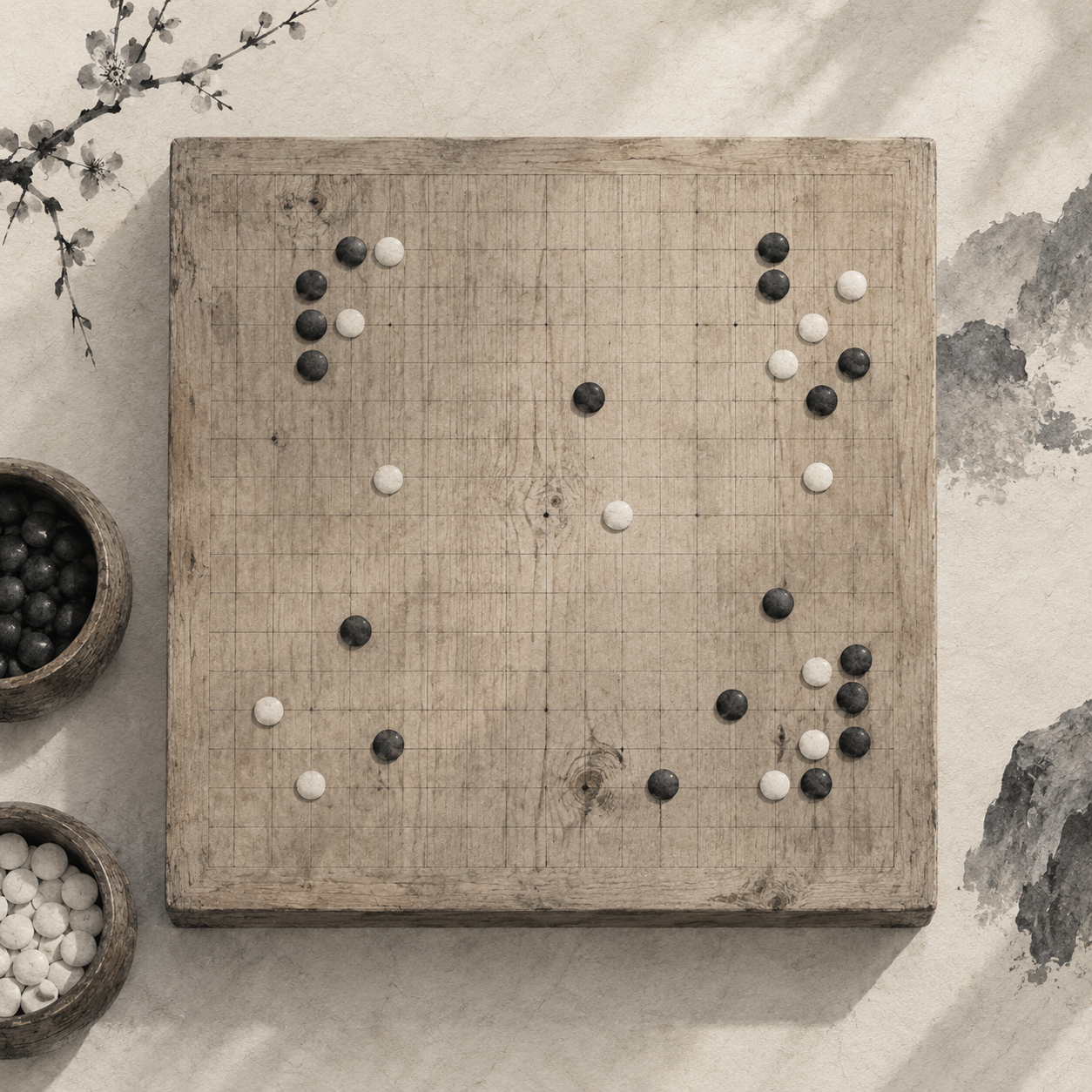
A few stones are on the board, and you are counting empty points along a diagonal. If the grid lines stand out more than the stones, your eye meets row after row of squares before it finds the pattern of play. A clear grid does not necessarily make a position easier to read.
Where the Lines Lead
The lines in a table separate cells. They tell you where one compartment ends and another begins. Lines on a board serve a different purpose: they form a coordinate system that leads your eye to the intersections. Stones sit where lines meet. The squares are merely the spaces between them.
A common Gomoku board has 15 lines in each direction and 225 intersections, where the stones are placed. Some people also play on 17-line and 19-line boards. The size changes the number of places to play, not the lines’ job: to help you find a point, not to divide the board into containers. Wikipedia’s Gomoku entry describes these board sizes.
Coordinates belong to intersections, too. On a 15-line board, the vertical lines run from A to O and the horizontal lines from 1 to 15. The central star point, or tengen, is H8. There are five star points in all, as noted in the Taiwan Renju Association’s Gomoku glossary. When you say H8, you mean the point where two lines cross, not a square in column H.
When Squares Take Over
Picture three black stones along a horizontal line, then an empty point, then another stone. You need to look along that line to judge how the stones might connect across the gap. Give every square a heavy border, and your eye is more likely to stop at the outline of the empty space. The pause is brief, but it recurs each time you look for a line of play. Thicker lines do not necessarily make the intersections clearer. The pale spaces enclosed by them begin to look like separate cells, with stones perched at their corners. You can still find the points. But each time you look, you must see past the grid before you can read the stones.
Gomoku patterns develop horizontally, vertically and diagonally. Whether stones touch, leave gaps or have open points at either end shapes your next move. Lines can show direction, but if they dominate the view, the changing pattern of stones slips into the background. When you assess a board, set up a few positions with gaps rather than looking only at an empty grid.
Fine Lines on Wood
A physical board offers another way to see the problem. On a Japanese go board, the tachimori technique uses the tip of a Japanese sword to draw lines along a straightedge, leaving marks so fine they barely seem cut into the wood. In its description of the technique, Kuroki Goishi Ten notes how it brings out the wood’s grain and color. The lines settle into the surface rather than turning it into a table.
Line width is only part of the effect. Grain continues between the lines, and the color varies slightly across the wood. The black lines do not have to supply all the structure you see. You can follow the grid while still seeing the surface that holds the stones; neither has to be the whole picture.
A screen cannot reproduce a cut line or wood grain, nor does it need a photograph of wood beneath the grid. The useful lesson is the division of labor. Lines should be present enough to lead you to an intersection. The background can have some depth of its own, so the lines need not carry the entire board. If decoration makes the stones harder to read, it should give way.
Lines show the way. Stones show the position.
The Lure of a Flat Screen
A web board often begins with a solid background and a set of evenly spaced lines. Empty, it looks orderly. But with no texture to rest on, your eye finds its densest pattern in the grid. To make the lines clearer on an empty board, it is tempting to darken them.
The problem may not appear until the stones arrive. Black and white stones should be the most noticeable changes in a position. Dark grid lines instead run through the spaces between them, scattering small dark segments across the board. Your eye encounters those segments again and again as it moves from one stone to the next.
An empty board, then, should not decide the line color. Set up a straight line one move short of five, then a diagonal pattern with gaps. Can your eye follow the stones along each line at a glance? If you notice the grid before the unfinished pattern, there is reason to move it into the background.
What One Pixel Looks Like
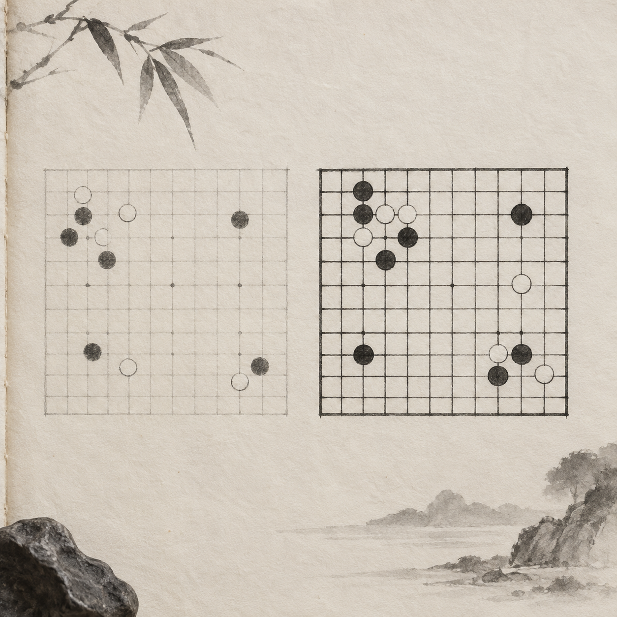
Setting a line to 1px in CSS does not mean it will look the same on every screen. At a device pixel ratio, or DPR, of 2, that width spans two physical pixels. At a DPR of 1.25 or 1.5, it spans a fractional number. The line’s position and the browser’s rendering also affect how its edges appear. The same style might look crisp on a phone and like a slightly wider gray band on a laptop. Antialiasing softens edges with neighboring pixels, which can make pale lines look fuzzy. Simply darkening them may put them back in competition with the stones. Judge width and contrast together on actual devices.
As you test, check whether intersections are equally easy to find along straight and diagonal paths, and whether zooming makes some lines look darker than others. Screenshots help with side-by-side comparisons, but it is best to view a game at its intended size. Whatever the pixel arithmetic, the test is whether your eye can reliably find the points of play.
Save the Strongest Contrast for the Stones
The board needs a hierarchy of light and dark: stones strongest, grid lines next, star points quieter still. Stones change with every move and must stand apart from the background and lines. The grid only needs to be easy to follow. Star points help you orient yourself; they need not look like extra stones.
That does not mean making the grid ever paler. If you have to lean toward the screen to find an intersection, the lines have faded too far. If the first thing you see from a distance is the complete grid, they may be too strong. Keep the stones fixed as you adjust the contrast between lines and background.
There is also a baseline for legibility. W3C WAI’s guidance on WCAG 2.1 non-text contrast says that parts of a graphic needed to convey information require a contrast ratio of at least 3:1 against adjacent colors. That is a threshold for recognizing information, not a recipe for making every line look alike. Nor does softening the grid remove the need to check that the stones remain visible.
Test It in a Game
Early in a game, stones are sparse, and you often look for the center and nearby intersections. By the middle game, your eye follows existing stones to judge where a pattern might extend. One board must work at both moments. Checking only whether the lines are clear at the start can miss how the grid interferes with patterns later. Try a simple sequence. First, find where you might play next. Then follow an unfinished diagonal. Finally, take in the whole board. If you keep having to guess where an intersection is, make the lines easier to distinguish. If the squares keep interrupting the diagonal, make the lines less prominent. Adjust for the problem you encounter, not for a predetermined line width.
A useful board shows you where to play when it is empty, then yields your attention to the stones. What stays with you should be how those stones connect and where the gaps remain—not how neatly the grid was drawn. Once the lines have guided you to a point, your attention can return to the move.
Once you find the point, return your attention to the stones.