You only wanted to play a game of Gomoku. First came the login, the sync prompt, the red dot, the permissions dialog. Before the board even appeared, your attention had already been taken elsewhere. B-route’s wager is simple: beauty is reason enough; not interrupting you should be part of the board.
Show the board before asking for an account
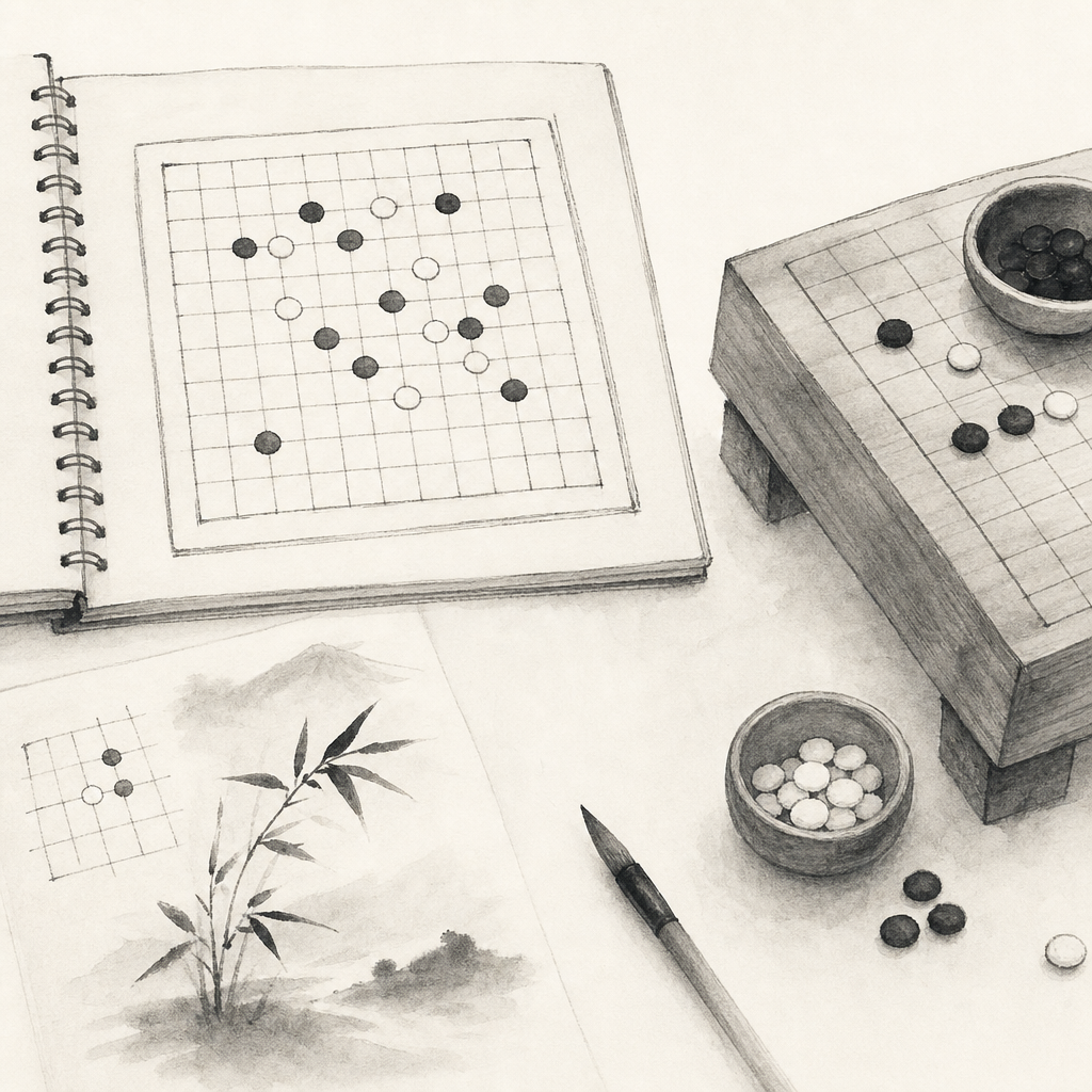
In the first second after you open the app, identity is not the point. The game is. You may only want to place a tengen opening and see whether Black’s second move near the star point feels too tight. If a registration page appears then, the rhythm is gone.
So the choice refused here is clear: no “log in before use.” An account can bring cloud sync, avatars, and social ties. It can also turn a quiet board into the front door of an account system. For a Gomoku app built around practice and touch, that trade is not worth it.
No account does not mean “fewer features.” It means leaving the first layer of the experience to the move itself. The faster the board appears, the easier it is to remember that diagonal, that break, and whether your next move should make an open three.
An offline core keeps the network out of the game
The basic acts of Gomoku are local: placing a stone, undoing a move, reviewing a line, clearing the board, keeping time. They should not become sluggish because the subway enters a tunnel, a café network flickers, or a server goes down for maintenance.
We took a cue from Android’s thinking on offline-first design: depend on local data first, so the app remains reliable without a stable connection. On the board, that means your draft records, settings, and basic practice live on the device first, rather than asking the network to approve every move.
The rejected alternative is to put every state in the cloud. It looks modern. It also adds loading, failure, and retry to an ordinary review. A game already has enough variation; connection status does not need to become another opponent.

No red dots, because attention has edges
A red dot is small, but it creates an unfinished task. You may be studying whether Black can restrain White with a jumping three, only to have a number pull at the corner of your eye. Even for an instant, the feel for the position becomes coarser.
The rejected alternative is to pin red dots to reviews, settings, new themes, and events. That can raise clicks. It also lowers quiet. Among the principles of calm technology is a beautifully restrained line: technology should require the smallest possible amount of attention. A board is an especially good place to honor it.
The red dot is small. The interruption is not.
If something has changed, it should be discoverable in the right place, not speak first every time you open the app. A refined interface does not hide everything. It knows when not to talk.
No push notifications, no turning a game into a to-do
Push notifications make sense for food deliveries, flights, and urgent messages. They are less obviously suited to a board. Much of Gomoku’s pleasure comes from approaching it by choice: you remember yesterday’s double-three judgment, open the app, and set the position up again.
The rejected alternative is to pull you back each day with lines like “come play a challenge” or “your winning streak has ended.” That copy works in the short term, but it turns play into a prompt. We would rather the app remain at the edge, in keeping with calm tech principles about respecting attention and offering information from the periphery.
That does not mean there is no rhythm by design. Timers, move feedback, and win-loss signals all have a place. They happen inside the game. They do not cross the threshold and knock on your door.
Data minimization starts at the design table
The most reliable privacy practice is not to collect data and then promise to protect it. It is to collect less from the start. Privacy by design often speaks of data minimization and limits on collection. Translated to this board, it means not saving a pile of irrelevant information simply because it might be useful someday.
The rejected alternative is to log every tap, pause, theme change, and undo count. Those numbers may produce handsome dashboards. They do not necessarily make a move better. When the core experience can be completed offline, excessive collection looks especially unnecessary.
Every feature left out gives the game back to itself
On the surface, these choices look like subtraction: no account, an offline core, no red dots, no push notifications, less collection. In practice, they protect the same thing: your ability to see a game from the first move to the last, with as little interference from the system as possible.
Take a concrete position. You play Black. Tengen lands. White answers close by. You plan to draw out what looks like a comfortable four-in-a-row, then turn back and make a double-three. If the app asks you to log in for sync, pops up a notification permission request, and shows three unread red dots, White is no longer the only thing you have to defend against.
A good board does not need to look busy. It can be modern, precise, and carefully made, while remaining calm most of the time. The quieter it is, the more clearly you can hear the weight of the stone.
The final trade-off: return agency to the player
Quiet is not emptiness. It is a choice.
If you are tired of being interrupted before you have even placed a stone, you can judge any board game app by this standard: is it helping you enter the position, or pulling you out of it? The next time you open the board, try just one game. See which move becomes clearer when there is a little less noise.